Plotting with gwrefpy 📊#
In this tutorial we will explore how to plot with the gwrefpy package.
This notebook can be downloaded from the source code here.
The plotting capabilities are built into the Model class. This means that once you have created a Model object, you can use the plotting methods to visualize the data and fits. By default the plots will be unformated matplotlib plots, but gwrefpy has several built-in plot styles and color themes that can be used to change the appearance of the plots.
Tip
If you are not within a Jupyter notebook, you can use the model.show_plots() method to show the plots in a separate window.
import gwrefpy as gr
gr.set_log_level("ERROR")  # Set log level to ERROR to reduce output

model = gr.Model("small_example.gwref")
This example data contains 4 wells and 2 fits. We can see this by printing the model object.
model
Model(name='Small Example', wells=4, fits=2)
Plotting well timeseries data 📈#
Now we can plot the data. We start by plotting all of the wells in the same figure.
Tip
If you append _ = before the plotting function, it will suppress the output of the plotting function and only show the plot.
_ = model.plot_wells(plot_style="fancy", color_style='color')
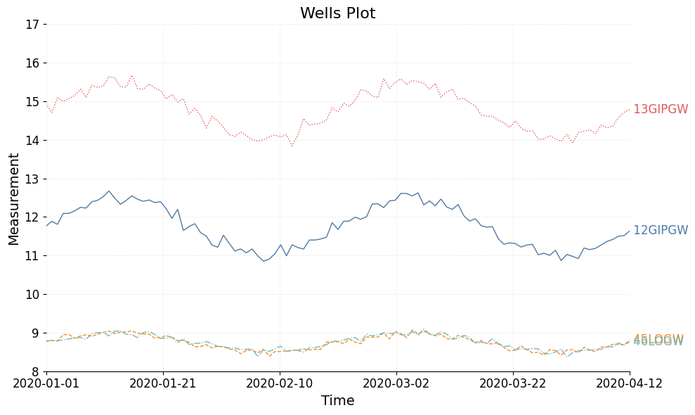
We can see that the labels for the two reference wells are overlapping. We can fix this by simply adding an offset to the text labels. Here we add a small offset to the two reference wells.
Note
The offsets are in the same units as the y-axis, so in this case meters.
offsets = {
"46LOGW":-.2,
"45LOGW":.2
}
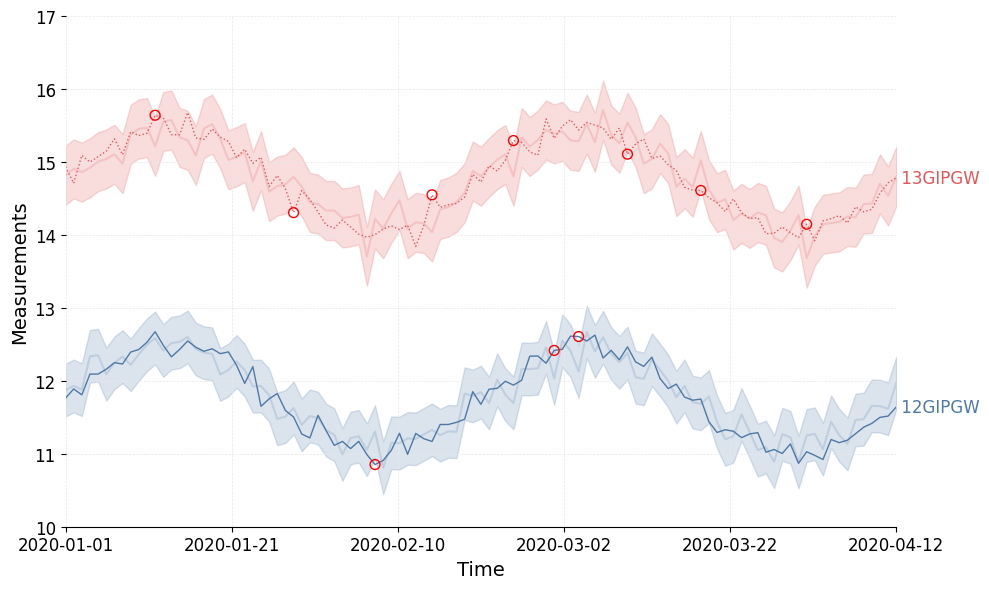
_ = model.plot_wells(plot_style="fancy", color_style='color', offset_text=offsets)

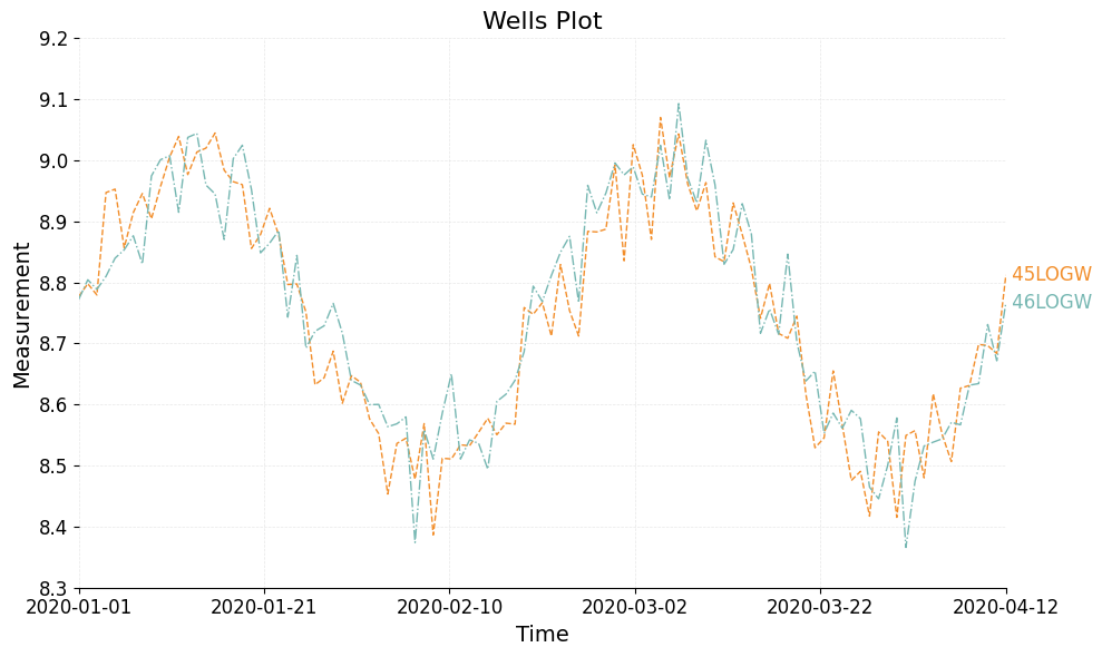
We can also plot wells by passing them as a list. Here we plot only the two reference wells in the model.
_ = model.plot_wells(wells=model.ref_wells, plot_style="fancy", color_style='color')
Plotting fitted data 📉#
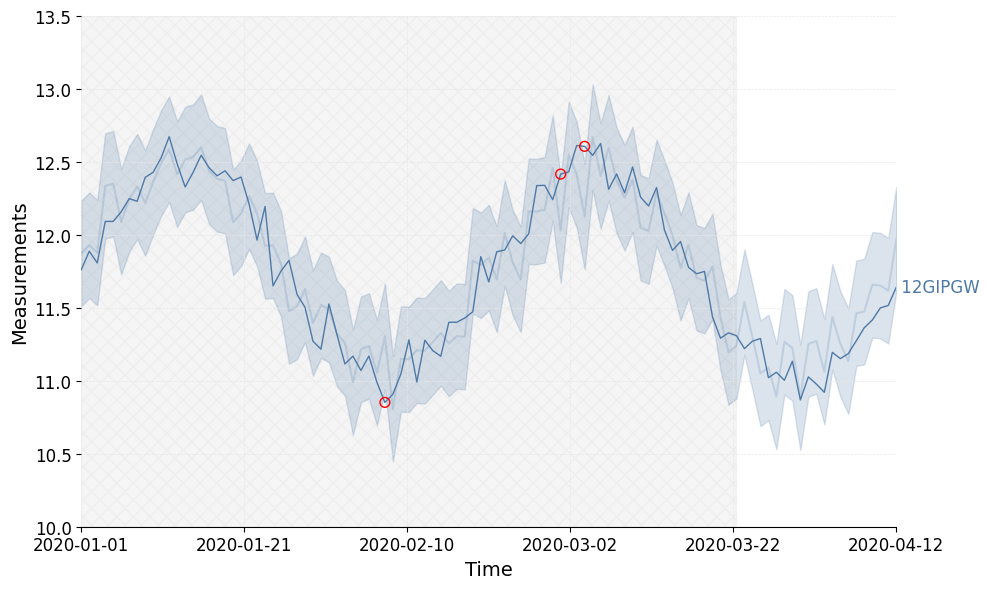
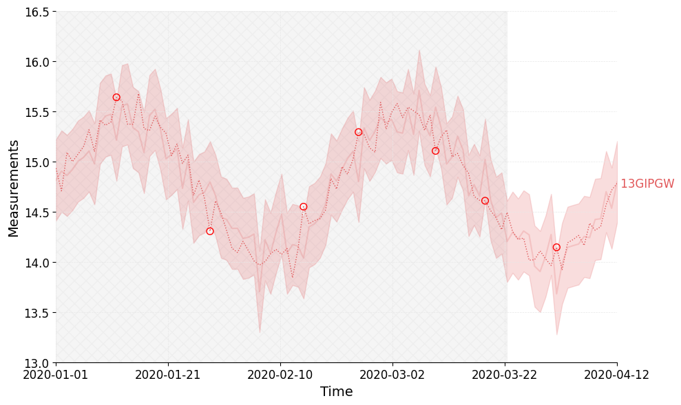
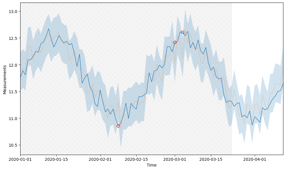
Now we can plot the fits. We can plot all of the fits in the model by simply calling the plot_fits method. The filled areas represent the prediction interval of each fit and the red circles mark outliers.
_ = model.plot_fits(plot_style="fancy", color_style='color', offset_text=offsets)
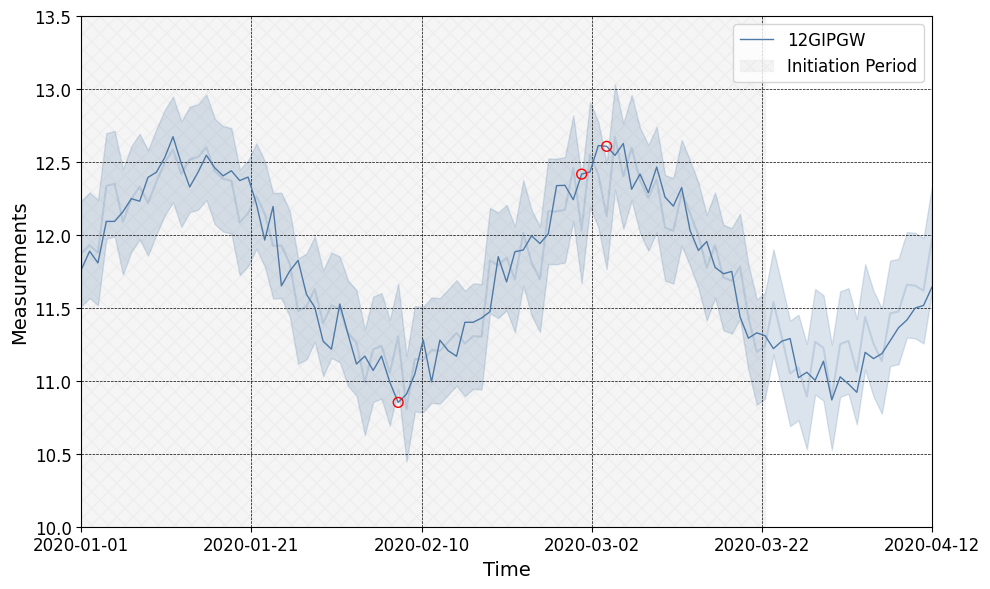
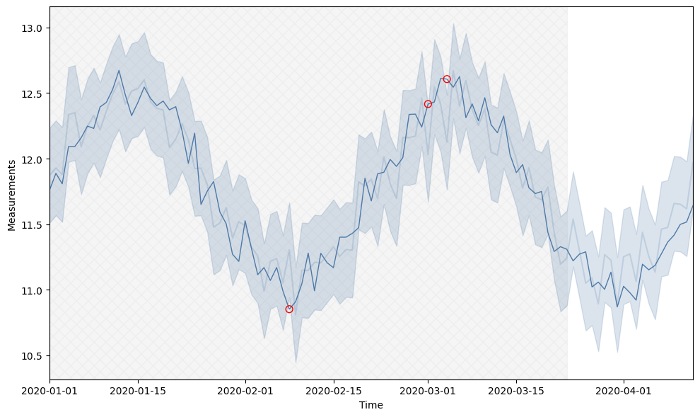
We can also plot them individually by passing only a sinlge fit to the function or by passing a list of fits and seeting the plot_Seperately argument to True. We can also show the initiation period by setting the show_initiation argument to True.
_ = model.plot_fits(plot_style="fancy", color_style='color', plot_separately=True, show_initiation_period=True)
Color style 🎨#
gwrefpy has several built-in color styles that can be used to change the appearance of the plots.
The default color theme is None, which uses the default matplotlib colors. You can set the color theme by passing the color_style argument to the plotting functions. The available color styles are:
'color': A color theme with distinct colors for each well and fit.'monochrome': A monochrome color theme with shades of gray.None: The default matplotlib colors, this is the default.
_ = model.plot_fits(fits=model.fits[0], color_style='color', plot_style=None, show_initiation_period=True)
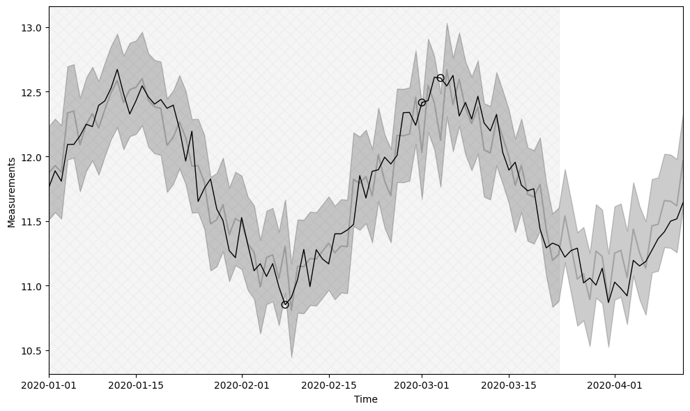
_ = model.plot_fits(fits=model.fits[0], color_style='monochrome', plot_style=None, show_initiation_period=True)
_ = model.plot_fits(fits=model.fits[0], color_style=None, plot_style=None, show_initiation_period=True)
Plot style 🎨#
gwrefpy has several built-in plot styles that can be used to change the appearance of the plots. The available plot styles are:
'fancy': A fancy plot style with grid lines and filled areas for the prediction intervals. This is the default.'scientific': A scientific plot style with no grid lines and no filled areas for the prediction intervals.None: The default matplotlib style, this is the default.
_ = model.plot_fits(fits=model.fits[0], color_style='color', plot_style='fancy', show_initiation_period=True)
_ = model.plot_fits(fits=model.fits[0], color_style='color', plot_style='scientific', show_initiation_period=True)
_ = model.plot_fits(fits=model.fits[0], color_style='color', plot_style=None, show_initiation_period=True)